From Thought to Entry
I tweeted that Obsidian needs better multimodal quick input, and the CEO of Obsidian Kepano replied: “Can you give examples of what you’re trying to do?”
Obsidian needs better multimodal quick input
Capture speed
The core problem in Obsidian is capture speed. Ideas, images, emotions; they flash into your mind and disappear. Kendrick Lamar talks about this:
“I have to make notes, because a lot of my inspiration come from meeting people or going outside of the country, or going around the corner to my old neighbourhood, talking to a 5-year-old little boy, and I have to remember these things, you know. I have to write them down, and then five or three months later I have to find that same emotion that I felt when I was inspired by it. So I had to dig all the way deep and see what were the things that triggered the idea.”
Kendrick is talking about two things here: getting it down fast, and being able to find the emotion again later. The second part is an organization and retrieval problem. But it depends entirely on the first part. If you don’t capture it in the moment, there’s nothing to retrieve. The chain starts with capture.
For me to really get to the main ideas I need to be able to hold on to those moments. That means going from thought to entry as fast as possible: text, photo, voice, video. I want to write every idea down.
What good capture looks like
I used to work on a journaling app called Futureland. One of the things we really got right was a quick multimodal input that let you go from thought to entry in seconds. Open the app, tap plus, and a new entry popped up. From there it was one tap to add a photo, take a picture, or write a note.
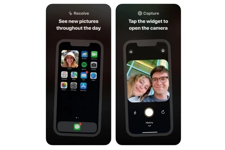
Some good examples of quick inputs are Instagram Stories and Locket (open on camera). These are capture-to-publish tools: the destination is predetermined (your feed, your friends), so there’s no organizing step at all.
Obsidian is different because things need to go to different places. But that’s exactly the point: the organizing step is necessary, it just shouldn’t happen at the moment of capture.
Things 3 has a big plus button that’s always visible in the app. Tap it and the keyboard opens right away. Everything lands in the inbox. There’s no “which project does this belong to?” before you can type. You capture first, organize later. That’s an interesting direction for Obsidian: what if every quick capture just landed in a single place, and you sorted it when you were ready?
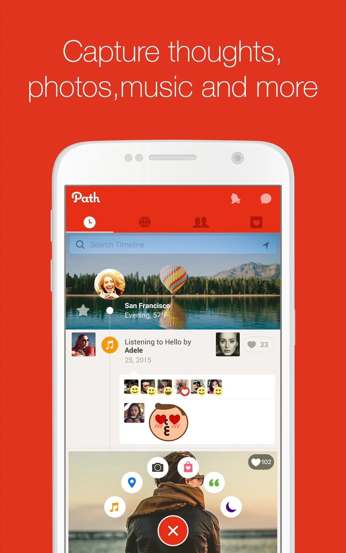
Path took a different approach. Instead of skipping the decision, it gave you one meaningful choice upfront: what medium? Text, photo, video. You’re deciding what kind of thing it is. That’s an interesting direction too: an Obsidian capture screen that asks “what do you want to capture?” instead of “what do you want to name it?”
Where Obsidian falls short
Most of these concerns are about the mobile app. Obsidian on desktop is amazing. But capture happens on the go, and that’s where the mobile experience matters most.
Obsidian has too much friction for this right now. Friction can be valuable in the right place, it slows you down when you need to think. But capture is exactly where you don’t want it. The moment between having an idea and recording it should have as little resistance as possible.
Obsidian has so much flexibility and so many tools that it sometimes goes at the expense of building an intuitive interface. I think that flexibility is worth a lot: everyone can create their own Obsidian. But better defaults would help the app be more understandable, especially for new users. Let people progressively add complexity instead of presenting it all upfront.
Three things could improve:
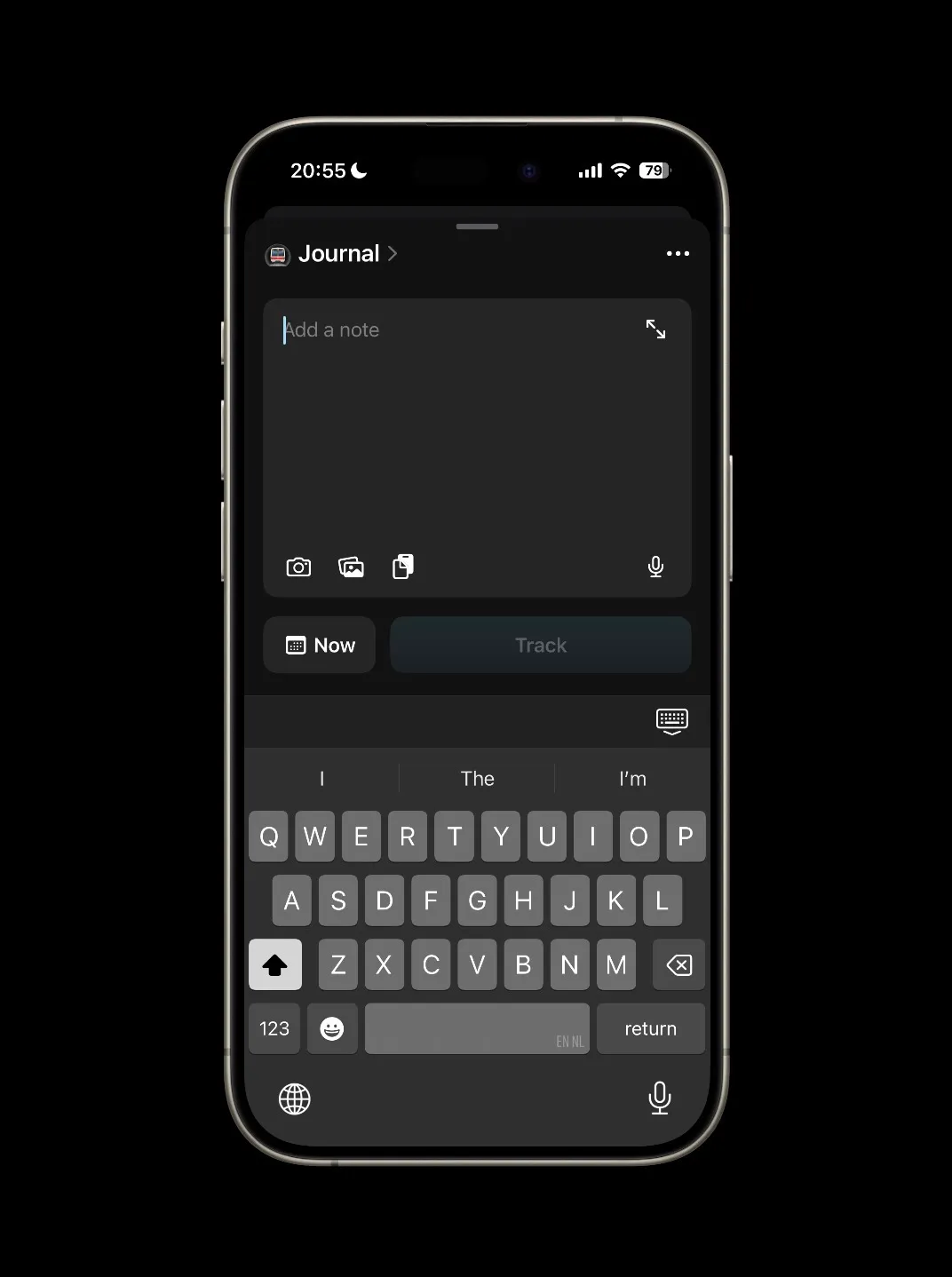
1. The plus button should be search-or-create
If I hit the plus on the menu bar it opens first on this new tab page.
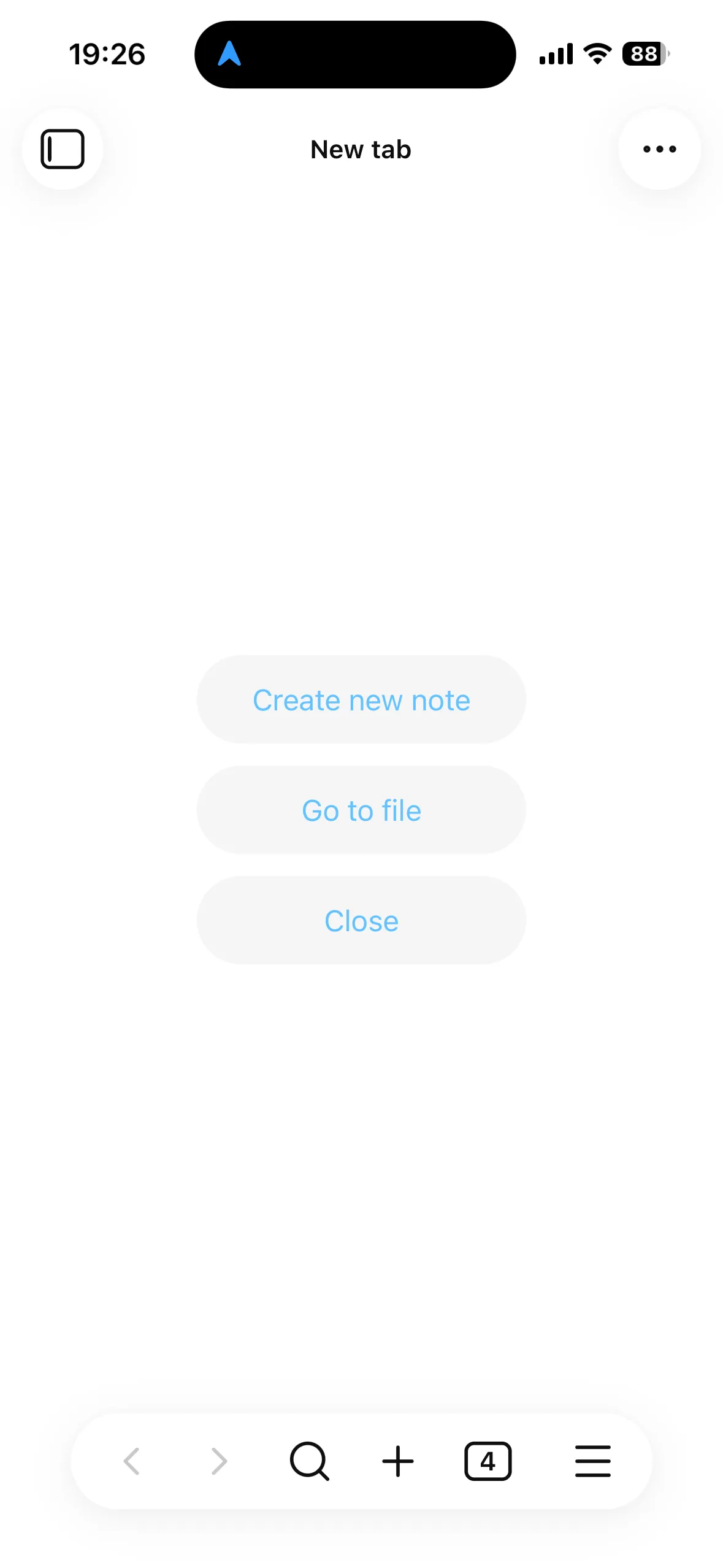
Before I can type I’m looking at a screen where I have to choose between creating a new note or searching for a note. Obsidian already uses a search-or-create pattern in other places (like linking), but not here. Why can’t the plus button just open the keyboard and let you type? If a note with that name exists, you go there. If it doesn’t, you create it. One action, no decision screen.
Notational Velocity, an early Mac note-taking app, was built entirely around this idea. The only way to create a note was through the search bar. Typing would live-search through your notes. Hitting enter would create a new note with the search query as the title.
This also closes a feedback loop. Every time you go to create something new, search-or-create nudges you toward related notes you already have. Sometimes you end up editing an old idea instead of creating a new one. Over time those nudges cause notes to self-organize into durable knowledge.
I know the iOS app now has widgets and quick tools, but when you use those you still need to start with writing a title. That brings me to the next point.
2. Reduce friction to capture
To make notes quickly, we need to remove every unnecessary step between thought and entry. Friction is valuable when it makes you think — but at the point of capture, it just kills ideas. Every extra tap, every choice that could be deferred, every screen that appears before the keyboard is a moment where a thought can fade.
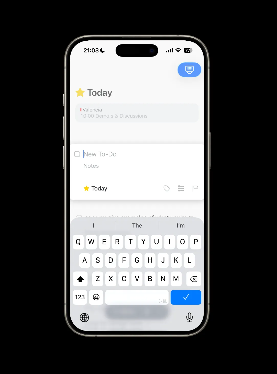
Even typing a title could be friction. What if the plus button dropped you straight into the note body, and the title got derived later — from the first line, or from the content itself? There’s probably a reason Obsidian starts with the title (it’s the filename, it’s how links resolve), but it’s worth questioning whether that has to come first. Community plugins already work around this — auto-generating titles, Zettelkasten-style IDs, or deriving names from content. The fact that people build plugins to skip the title step shows the default is fighting the user. Daily notes already skip this step too. What would an Obsidian look like where every note could start that way?
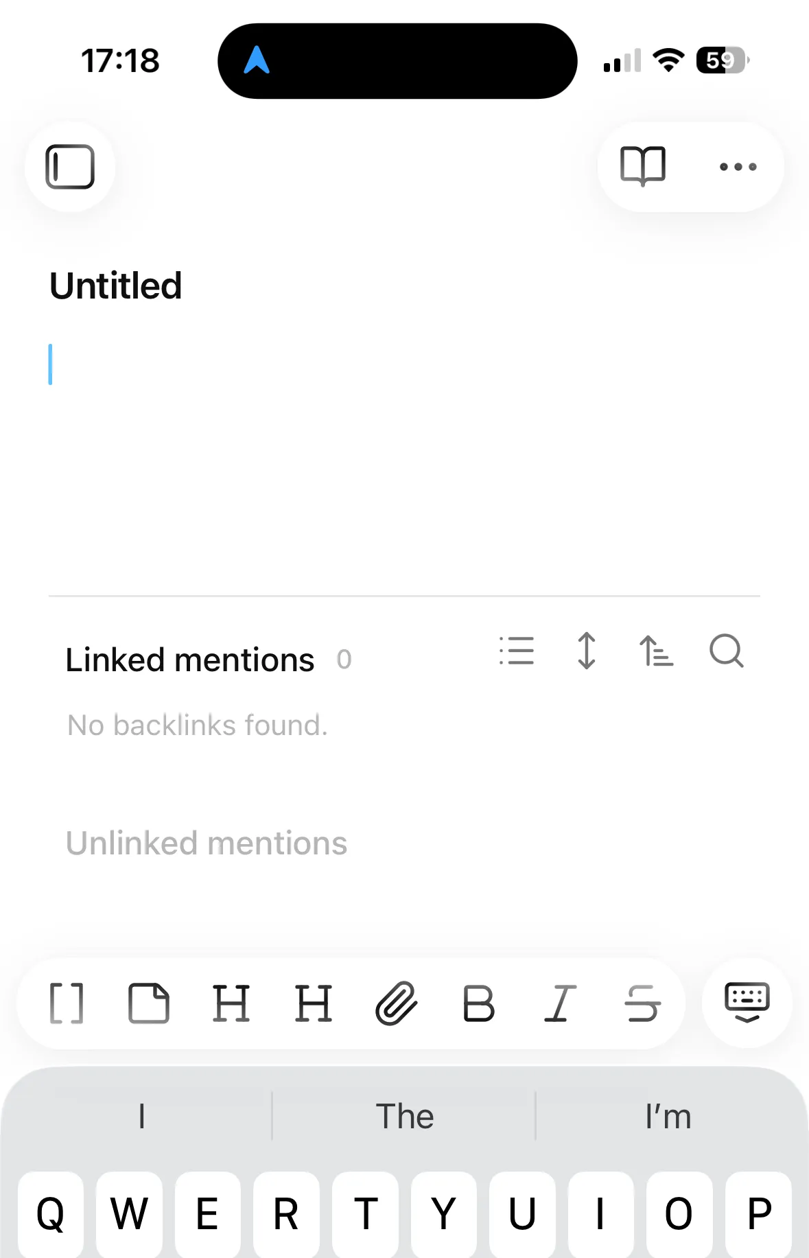
3. The toolbar needs progressive disclosure
Once I’m in a note, the toolbar is a super tiny bar of tools with almost no spacing between the buttons. On mobile it’s quite finicky to click them.
Chat apps like iMessage, WhatsApp, and even ChatGPT have solved this well. They give you a text input and a plus button. Behind that plus button, folded away, lives a lot of complexity: camera, photos, location, files. It’s clean at first sight but everything is still accessible.
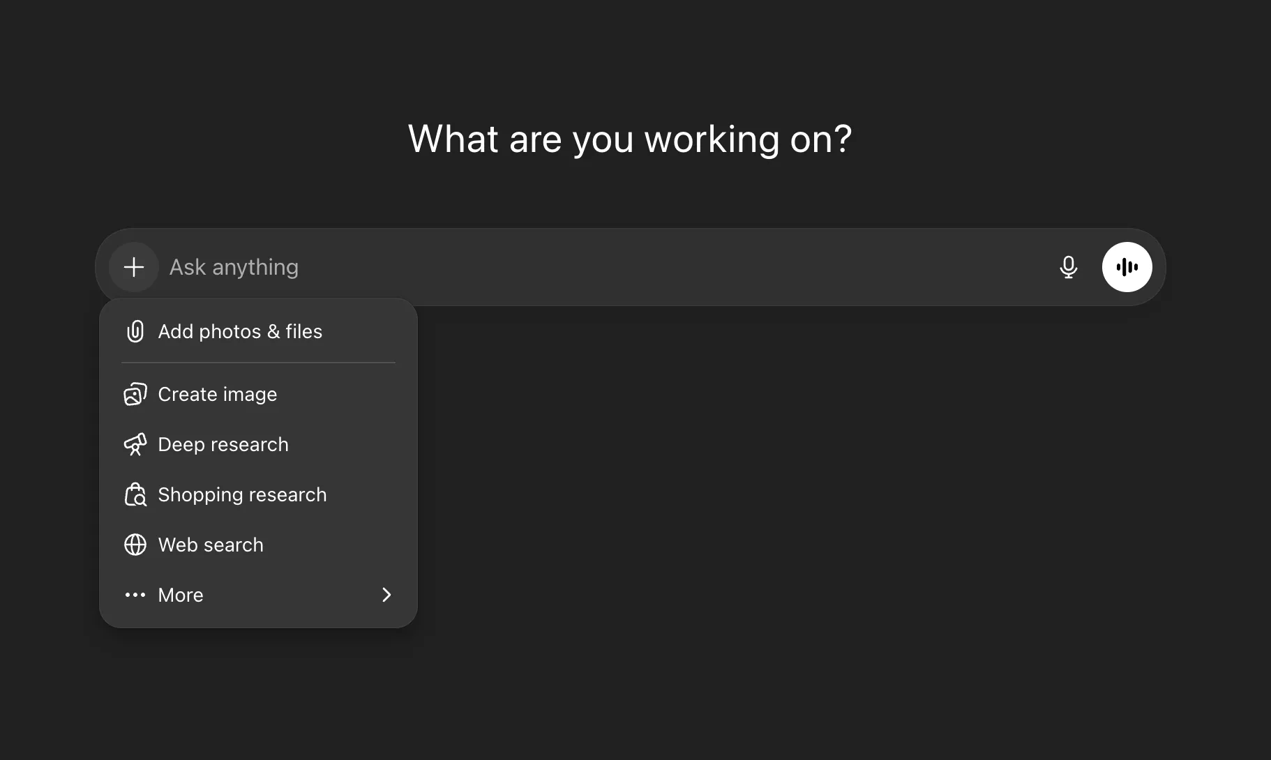
Obsidian could do the same. Show a text input and a plus button by default. Behind the plus: photo, voice, video, camera. Bigger buttons, more spacing. The full markdown toolbar can still exist, just folded one level deeper.
Obsidian has some good patterns like daily notes. Daily notes with the append widget get close to what I’m describing: no title decision, no folder choice, just write. That’s already a real capture layer for text. But it doesn’t extend to photos, voice, or video. And it locks everything into a single chronological stream rather than letting ideas land as their own atomic units. Daily notes solve the routing problem, not the multimodal capture problem.
The vault as destination
It could be that the real capture layer isn’t an app at all. A wave of hardware startups are working on this problem: the Limitless Pendant records conversations, the Humane Pin tries to replace your phone for quick interactions, Meta’s Ray-Bans let you take photos and video hands-free. These devices are built around the idea that capture should be ambient, not something you have to stop and open an app for. But they all need somewhere to send their input. My own Obsidian vault should be that destination.
Capture first, organize second
The deeper issue here is that Obsidian violates the capture, organize, synthesize sequence. There’s a natural order to creative work: capture first, organize second, synthesize third. You spread everything out before you arrange it, and you arrange it before you make something new from it. Many creative tools violate this sequence. They’re designed for organizing first. Name the file before you can write in it. Create your Photoshop layer before you can draw on it. Obsidian does the same: it forces you to organize (title, folder) before you can capture. The UI suggestions above help, but the real unlock is separating these two acts entirely: let everything land first, then route it afterward. That routing could be agent-assisted: an agent proposes a destination, you confirm. This is different from the decision screen I’m criticizing because the cost of being wrong is low. If the agent misfiles something, you move it. If the decision screen blocks you before capture, the idea is gone. A wrong suggestion you can correct is better than a mandatory choice you have to make in the moment. You still get the cognitive beat of deciding what something is, without the friction blocking capture.